
The Netherlands has a very extensive public transport network. However, public transport often doesn’t cover the entire journey a traveler wants to make. Shared mobility systems can provide a solution for this last mile of someone’s trip.
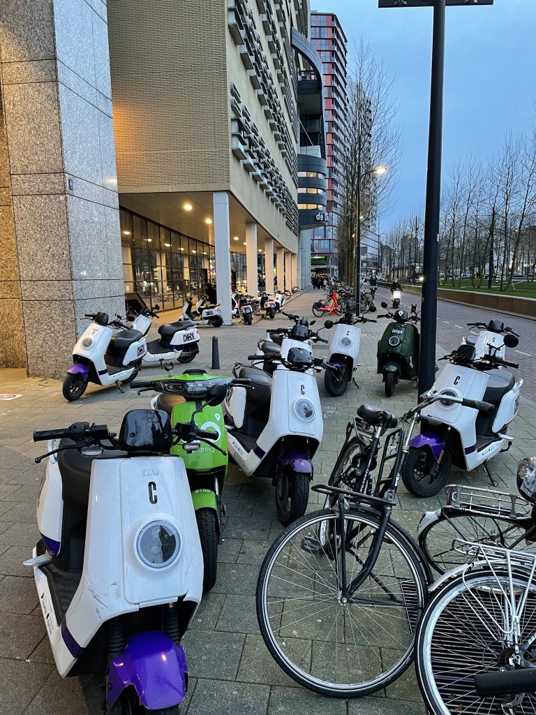
In recent years we’ve seen an influx of several forms of shared mobility in the Netherlands: an increase in shared bike and car providers and the introduction of shared scooters and cargo bikes.
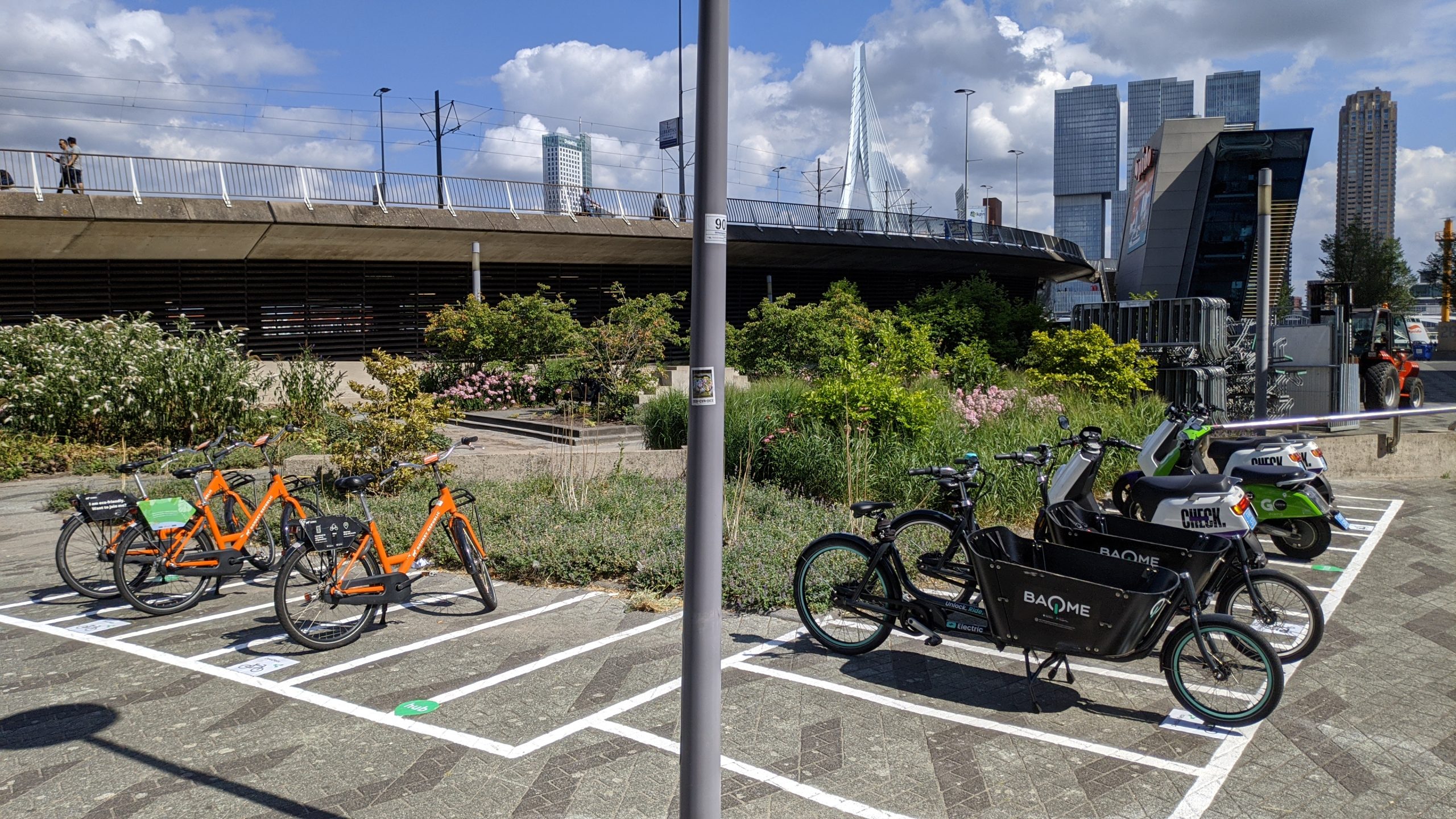
Whereas shared cars and cargo bikes often are station based, shared bikes and scooters can be parked almost anywhere. In some cities this has led to blocked sidewalks, a great nuisance for disabled people and people pushing prams.
Shared mobility hubs
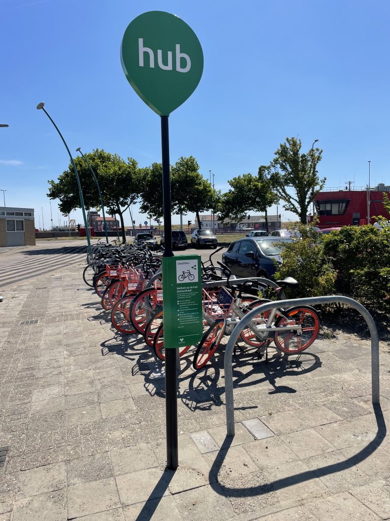
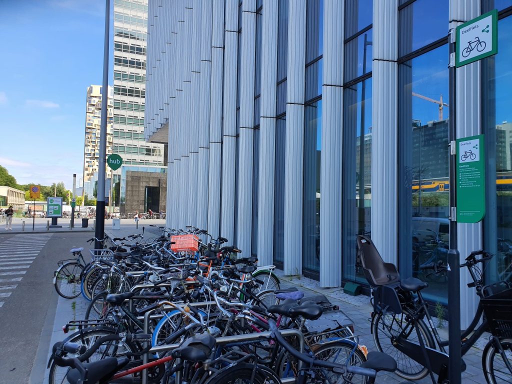
Several municipalities have therefore decided to group shared mobility in mobility hubs; locations where you can rent and bring back a shared vehicle. Mijksenaar has been commissioned to create a new identity for these new mobility hubs.
The green drop
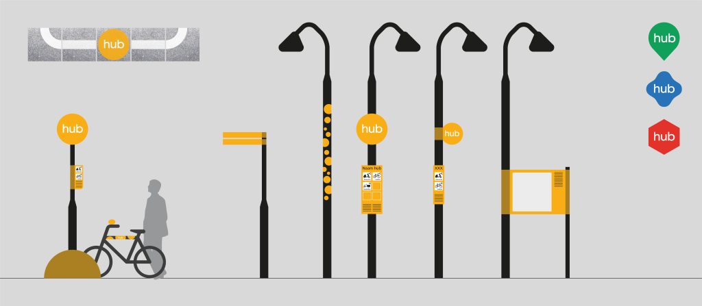
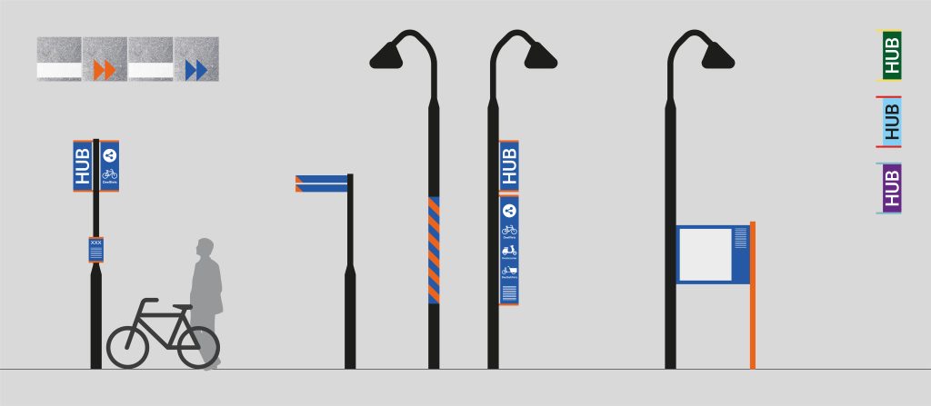
After a research phase in which we conducted a benchmark into existing identities, we designed three different concepts:
- A system based on the one already used in the provinces of Groningen and Drenthe.
- A two-colored system consisting of flags.
- A black and white system with a strong accent colour, using only newly designed elements.
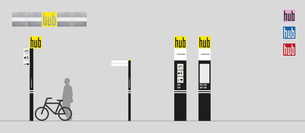
The new identity concepts were presented to a group of approximately 60 municipalities, regions and transport organizations. The first concept was selected and developed further into a definitive design.
Open source
The aim of this project was to design an identity for hubs that could be used by all municipalities and regions in the Netherlands. It also needed to be suitable for all types of shared mobility hubs.
We designed an identity that consists of a limited number of multifunctional elements. The whole system is open source and publicly available; Illustrator files are available of all the designed elements. These files contain clear, step-by-step instructions on how to use them and refer to the parts of the design that can be altered. This is to ensure that the hubs look the same wherever you go, but that their information is adapted to the local situation, strengthening a sense of place.
In the upcoming months the first shared mobility hubs using this new identity will be realized and evaluated. Mijksenaar is really proud of the end result and is looking forward to seeing our ‘green drops’ pop up throughout the Netherlands.
Are you interested in implementing this new hub identity in your region? If so, reach out to us!