
With the number of bikes forever on the rise in the Netherlands, creating enough parking spaces for them has become more and more of a challenge. The solution? Building indoor, and often underground, bike parking facilities.
P+bike
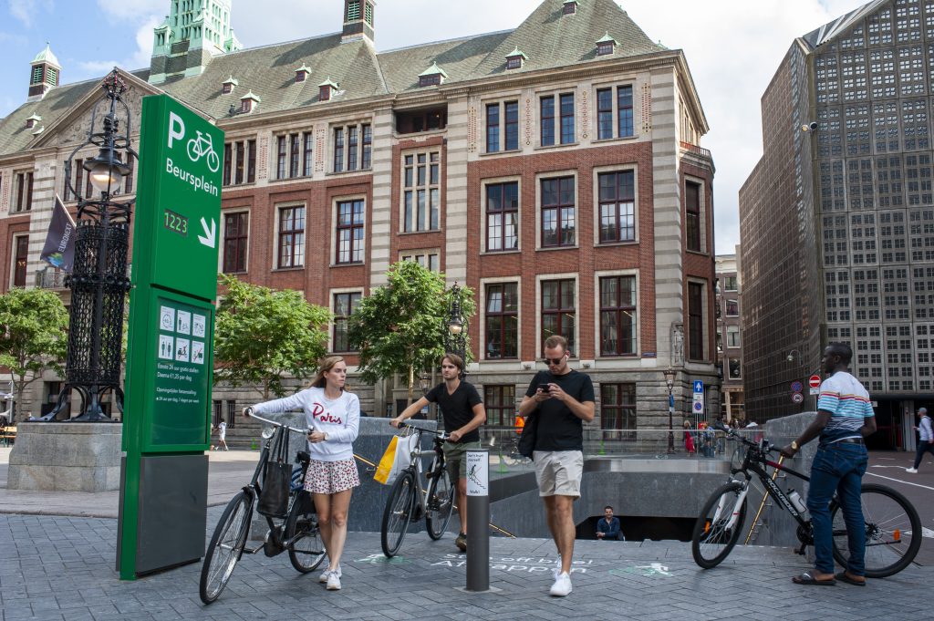
In the last decade, dozens of these parking facilities were built near stations and in city centers. To make the bike parkings recognizable and usable, Mijksenaar designed a clear, human-centric wayfinding strategy and design.
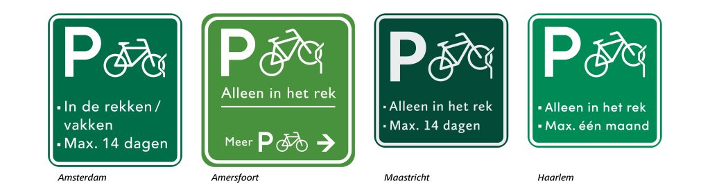
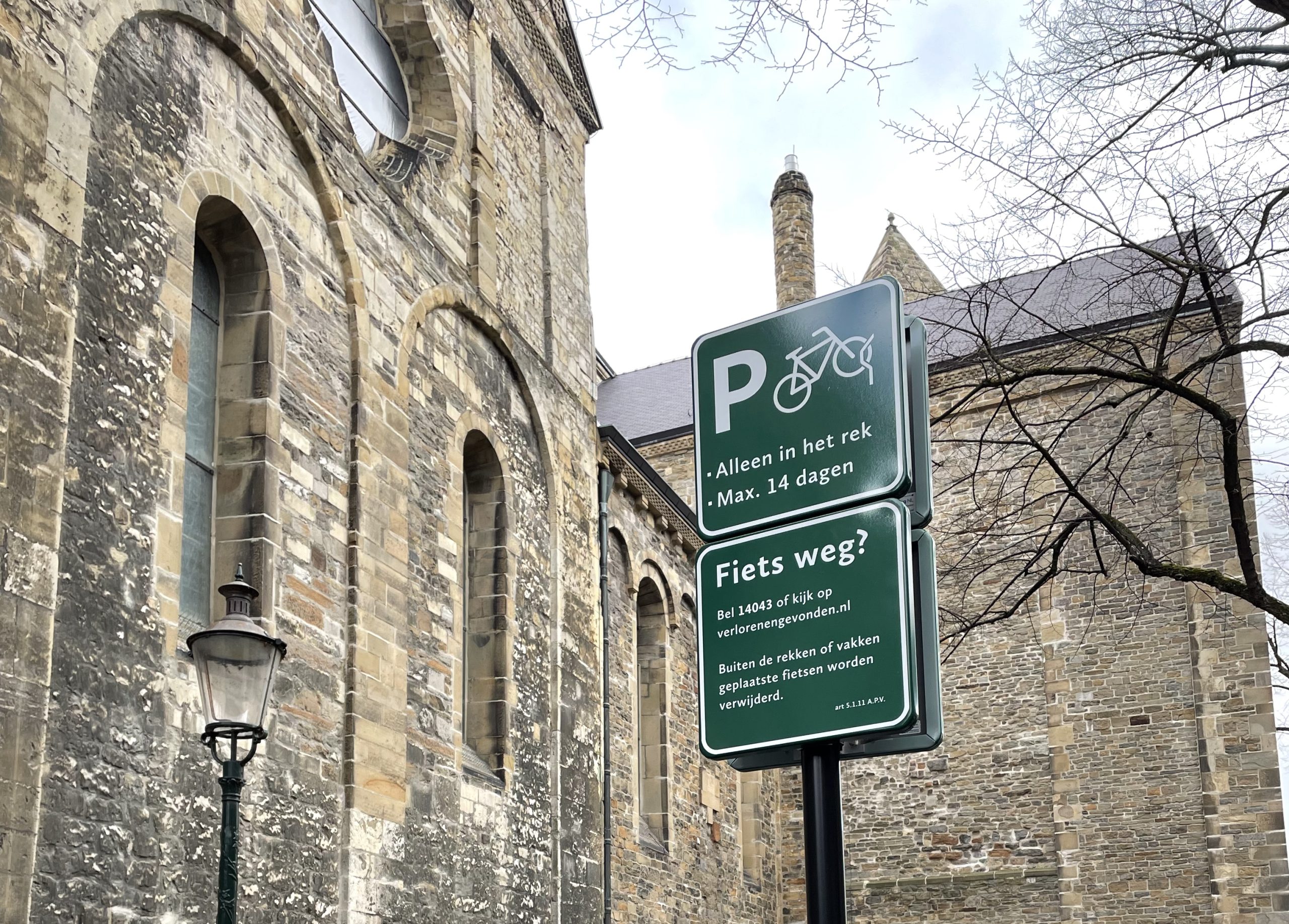
On an urban scale, the identification–consisting of the letter P plus the symbol of a bike– is visible and recognizable from a great distance. On a human scale, users can find all the extra information they need about services in the parking facilities.
Designs with a local twist
We were commissioned to design these wayfinding systems for several cities in the Netherlands including Amsterdam, Amersfoort and Maastricht. By using the same pictograms and color scheme for all cities, we’re well on our way towards creating a universal cycling language for the Netherlands as a whole.
Mijksenaar has also adapted the sign design of all systems in such a way that they fit the character and scale of each city. For Amersfoort we chose a shade of green that matched the city wayfinding we designed previously. For Maastricht, we selected a green and light gray color that matched with the local stone used in the city’s buildings (see below).